LabPlot in Python: Signal Processing and Spectral Analysis Workflow
A hands-on Python tutorial replicating LabPlot's scientific data analysis workflow: signal smoothing, Fourier filtering, peak fitting, and batch automation.
A new Python tutorial published by Marktechpost on 23 August 2026 walks through a full scientific data analysis pipeline modelled on LabPlot's architecture, using NumPy, SciPy, pandas, and matplotlib. The guide builds reusable classes that mirror LabPlot's column types, spreadsheets, and project model, then applies them to a spectroscopy example: cleaning interference, fitting a multi-Gaussian model, and running the same analysis across a batch of temperature-dependent spectra. No native LabPlot installation is required.
What happened
| Detail | Value |
|---|---|
| Published | 23 August 2026 |
| Source | Marktechpost tutorial |
| Core libraries | NumPy, SciPy, pandas, matplotlib |
| Optional SDK | pylabplot (falls back to emulation if absent) |
| Output format | .lml-style XML (LabPlot-compatible), PNG figures |
| LabPlot version emulated | 2.12.1 (XML version 15) |
| Statistics computed per column | 20 quantities (LabPlot Column Statistics dialog) |
The tutorial reconstructs LabPlot’s internal structure in pure Python. Three core classes do most of the work: AbstractAspect (a named tree node), Column (a typed NumPy vector with a plot designation), and Spreadsheet (a container of columns with a pandas export method). A Project class wraps everything and serialises to XML.
The Column class computes 20 statistics matching LabPlot’s own Column Statistics dialog: count, min, max, arithmetic, geometric, harmonic, and contraharmonic means, mode, quartiles, interquartile range, trimean, variance, standard deviation, skewness, mean absolute deviation, median absolute deviation, kurtosis, and Shannon entropy. A text sparkline function previews each column’s shape in the terminal, mirroring the sparkline header introduced in LabPlot 2.11.
What the analysis pipeline actually does
The tutorial is structured in stages. Each stage maps to a named analysis kernel inside LabPlot’s GUI:
- Import: An
AsciiFilterclass handles separator auto-detection, comment characters, and row/column limits, matching LabPlot’s text import dialog. - Signal conditioning: Smoothing and numerical differentiation run before any spectral work.
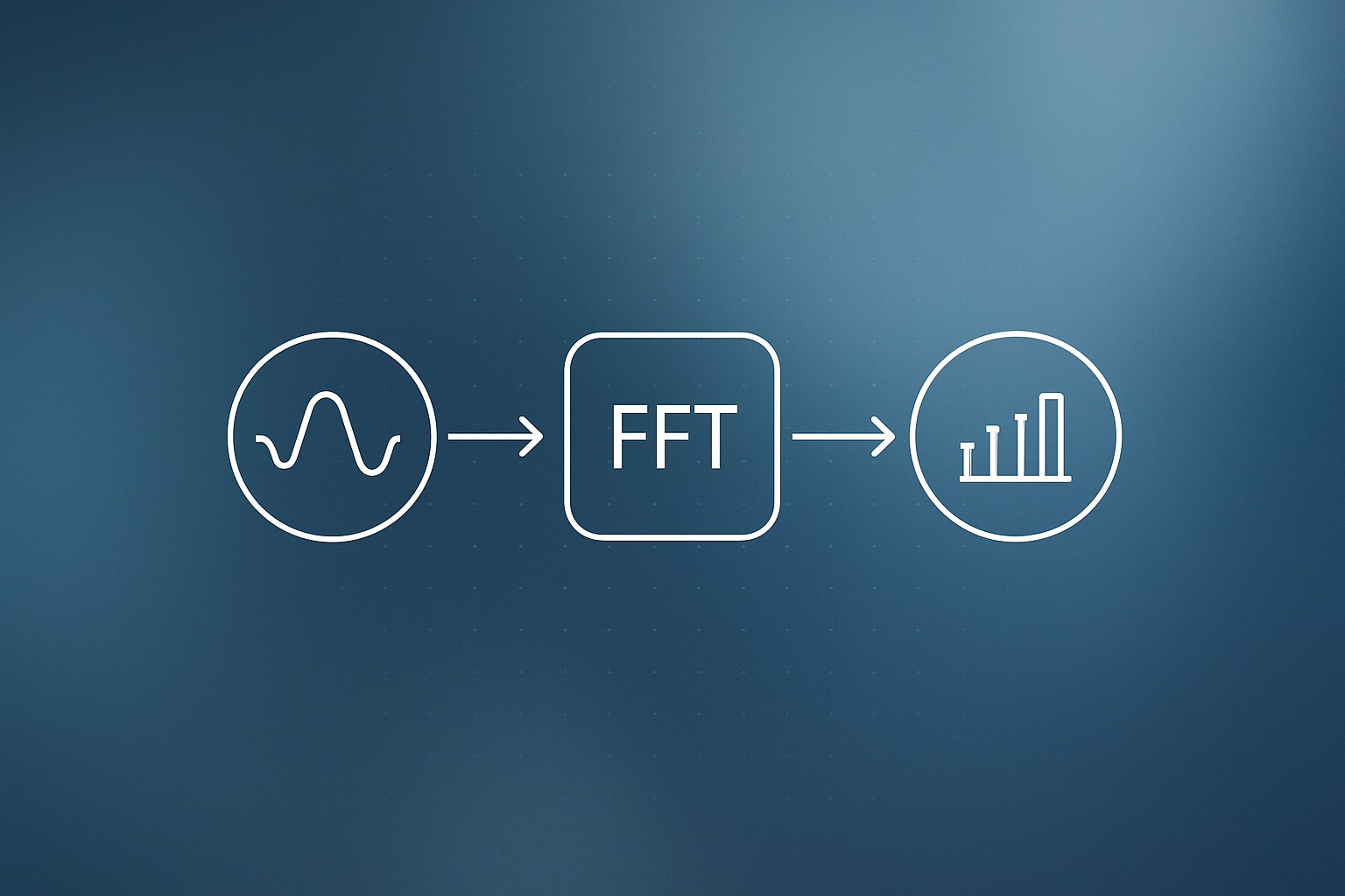
- Fourier analysis: A FFT-based filter removes periodic interference from the spectrum before peak detection.
- Peak detection: Peaks are identified in the cleaned signal, with overlapping peaks handled by a multi-Gaussian nonlinear fit using
scipy.optimize. - Diagnostics: Residuals are plotted and statistical diagnostics from the fit are printed alongside the chart.
- Export: Figures go out as PNGs, project data as .lml-style gzip/bzip2/lzma-aware XML files.
Why it matters
LabPlot is a strong free alternative to Origin or Igor Pro for scientists who need reproducible, publication-quality plots with built-in statistics. Its Python SDK (pylabplot) is still relatively young, and running LabPlot in headless or cloud environments like Google Colab is not straightforward. This tutorial fills that gap by making the workflow fully scriptable.
For business users, the more relevant angle is batch automation. The final section of the tutorial takes the full spectroscopy pipeline and loops it across multiple temperature-dependent spectra, collects the per-spectrum fit parameters, and fits a secondary trend across them. That pattern applies anywhere you process large volumes of similar files: sensor logs, financial time series, product quality measurements, or website performance data.
The code is also a clean example of building domain-specific tooling on top of general-purpose libraries. The AbstractAspect tree pattern, where each node knows its parent and children, is the same structure used in GUI application frameworks and document object models. Teams that build data pipelines for clients can adopt this approach to give their scripts a logical hierarchy rather than a flat collection of functions. If you are exploring similar AI and data integration work for your own operations, the pattern is worth studying.
Our take
The tutorial is genuinely well-structured. Most “Python for scientists” guides dump a handful of SciPy calls into a notebook and call it done. This one actually mirrors the mental model of a real GUI tool, which makes it easier for teams switching from LabPlot or Origin to maintain consistent terminology across code and documentation.
That said, be realistic about scope. The 20-statistic column class is thorough, but contraharmonic mean and trimean will not appear in most business analysis contexts. If you are adapting this for a production pipeline, strip it back to the quantities your team actually interprets. The Fourier filtering approach also assumes the interference is periodic and stationary, which is fine for spectroscopy but not always valid for noisy real-world sensor data.
The batch section is the most practically useful part. Fitting a secondary trend across per-file parameters (temperature dependence of peak position, for example) is exactly the kind of second-order analysis that gets missed when people treat each file in isolation. We have seen this pattern come up repeatedly in client projects involving sensor diagnostics and e-commerce performance data. The code structure translates well outside of spectroscopy.
One honest limitation: the tutorial runs without pylabplot installed, falling back to emulation. That means the .lml output may not round-trip perfectly into a real LabPlot project on first try. Test the XML import before committing to this as your archival format.
What to do about it
- Clone or copy the environment setup block and verify it runs in your Python environment (the tutorial targets Colab but works locally).
- Run the spectroscopy example end-to-end before modifying anything, so you have a known-good baseline output to compare against.
- Swap in your own tabular data by replacing the
AsciiFilterinput; the column and spreadsheet classes accept any NumPy-compatible array. - For batch work, identify the per-file parameter you want to trend (peak position, amplitude, noise floor) and wire it into the secondary fit step.
- If you need LabPlot compatibility, install
pylabplotand test .lml round-trips in the actual LabPlot 2.12 GUI before treating the XML as archival storage.
If automated data pipelines are on your roadmap but building them in-house is not, our workflow automation service covers exactly this kind of file-processing setup.
Frequently asked questions
Can I use LabPlot's analysis features in Python without installing LabPlot?
Yes. The tutorial builds Python classes that replicate LabPlot's column types, spreadsheets, and project structure using NumPy, SciPy, pandas, and matplotlib. The optional pylabplot SDK is supported but not required; the code falls back to emulation if it is not installed.
What is a .lml file in LabPlot?
An .lml file is LabPlot's native project format, stored as XML and optionally compressed with gzip, bzip2, or lzma. It records the full project tree including spreadsheets, columns, plots, and analysis results. The tutorial saves output in a compatible .lml-style format.
How does multi-Gaussian peak fitting work in SciPy?
scipy.optimize is used to fit a sum-of-Gaussians model to spectral data. Each Gaussian has three parameters: amplitude, centre, and width. The optimizer minimises the residuals between the model and the measured spectrum, and the tutorial includes diagnostic plots of those residuals.
How does the batch automation section work?
The tutorial loops the full analysis pipeline over multiple input files (temperature-dependent spectra in this case), collects the fit parameters from each file, and then fits a secondary trend across those parameters to reveal how they change with temperature. The same pattern applies to any set of similarly structured data files.